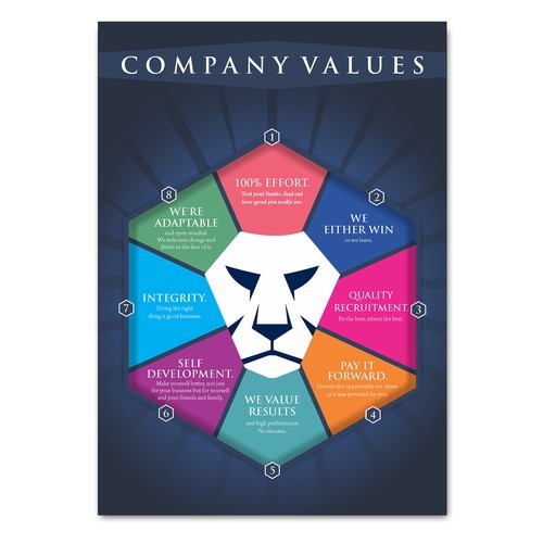
Designing eye-catching posters is a powerful way to promote your business, combining visual appeal with concise messaging to capture audience attention quickly. From defining clear objectives to balancing composition and using contrasting colors, the art of poster design requires careful consideration of various elements to create a compelling and effective marketing tool.
Table of Contents
Section 1
Section 2
Section 3
Section 4
The Psychology Behind Color Choices
Color psychology plays a crucial role in designing effective business posters, as different hues can evoke specific emotions and influence consumer behavior. Red, for instance, is associated with passion and excitement, potentially increasing heart rate and creating a sense of urgency. Blue, on the other hand, often conveys trust, stability, and professionalism, making it a popular choice for corporate branding. Yellow is linked to optimism and creativity, while green can represent growth and harmony. When selecting colors for your poster, consider the emotional response you want to elicit from your audience and how it aligns with your brand message. It’s important to note that color associations can vary across cultures, so research your target market to ensure your color choices resonate appropriately.
Effective Use of Typography in Posters
Typography plays a crucial role in poster design, serving as both a visual element and a means of conveying information. Effective use of typography can significantly enhance the impact and readability of your business poster. When selecting fonts, consider using a combination of serif and sans-serif typefaces to create contrast and hierarchy. Limit your choices to two or three fonts to maintain clarity and avoid visual clutter. The size and weight of text should be used strategically to guide the viewer’s eye and emphasize key information . Pay attention to leading (line spacing) and kerning (letter spacing) to ensure optimal readability. Alignment is also critical; use a consistent system to line up key elements and create a balanced layout. Remember that typography is not just about aesthetics but also about effectively communicating your message. As Janine Henrichs, a Shillington graduate, notes, “Typography on your poster can have a profound effect on the way audiences digest and perceive the information that is being conveyed by the text
Balancing Visual Elements for Maximum Impact
Balance in graphic design is crucial for creating visually appealing and effective posters that capture audience attention. It involves distributing visual elements across the composition to achieve a sense of stability and harmony. Designers can employ various types of balance, including symmetrical, asymmetrical, and radial, to create different effects and convey specific messages. Symmetrical balance creates a sense of order and stability, while asymmetrical balance can add tension and visual interest. The strategic use of color, shape, and size can also contribute to balance, with small areas of bright colors balancing larger areas of neutral tones, or complex shapes balancing flat, plain compositions. Achieving proper balance ensures that the viewer’s eye is guided through the poster’s content effectively, enhancing the overall impact and communication of the business message.
