Poster design is a powerful visual art form that combines creativity and strategic communication to capture attention and convey messages effectively. From establishing a strong concept to utilizing negative space and typography, the art of crafting a compelling poster involves several key elements that work together to make a design truly pop.
Table of Contents
Section 1
Section 2
Section 3
Section 4
The Role of Color Psychology in Poster Design
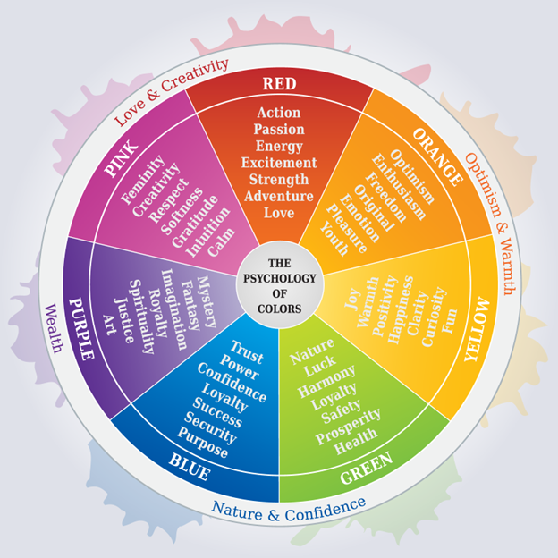
Color psychology plays a crucial role in poster design, influencing viewers’ emotions and perceptions. Different colors evoke specific psychological responses: warm colors like red, orange, and yellow are associated with energy and optimism, while cool colors such as blue and green symbolize peace and harmony. For example, blue often conveys security and trustworthiness, red signifies power and passion, and yellow represents optimism and freshness. Designers strategically use color combinations to create visual hierarchy, guide attention, and reinforce the poster’s message. High-contrast color pairings can make elements stand out, while complementary colors create balance. Cultural context is also important, as color meanings can vary across different societies. By understanding these psychological impacts, designers can effectively trigger desired emotional responses and enhance the overall effectiveness of their poster designs.
Using Typography to Create Visual Hierarchy
Typography plays a crucial role in creating visual hierarchy within poster design, guiding the viewer’s eye and emphasizing key information. Designers use various typographic elements to establish a clear hierarchy, including size, weight, color, and spacing. Larger font sizes are typically employed for headlines or main messages to grab attention, while smaller sizes are used for supporting text (1)(4). Font weight can also differentiate importance, with bolder typefaces drawing more focus than lighter ones(2). Color contrast between text and background, as well as between different text elements, helps to further define the hierarchy (3). Additionally, designers may utilize different font styles, cases, and alignments to create distinct levels of importance within the poster’s content (4). By carefully manipulating these typographic elements, designers can effectively structure information, ensuring that the most critical messages are immediately apparent to viewers while maintaining overall visual harmony and readability

