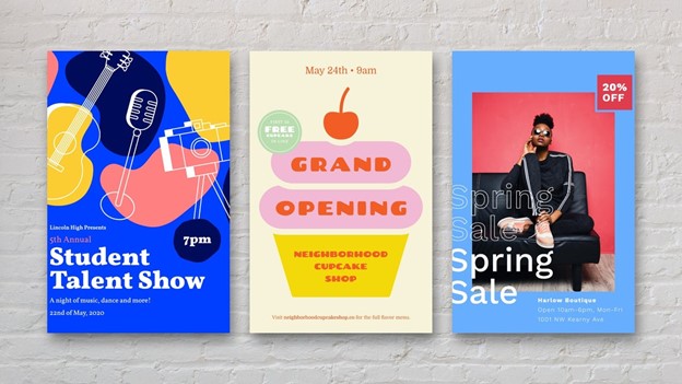
Flyers remain a powerful marketing tool for businesses, offering a tangible way to capture attention and convey key messages in an increasingly digital world. This blog explores effective strategies for designing eye-catching flyers that not only grab attention but also drive measurable results for your business.
Table of Contents
Section 1
Section 2
Section 3
Section 4
Choosing the Right Color Scheme for Maximum Impact
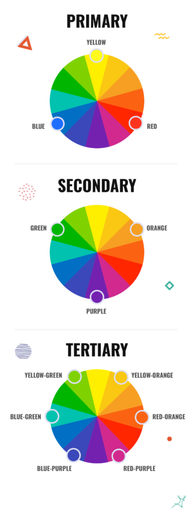
Selecting an effective color scheme is crucial for creating flyers that grab attention and convey the right message. High-contrast color combinations, such as complementary colors or triadic schemes, can maximize legibility and visual impact. For example, blue paired with reddish-orange and orange-yellow creates a vibrant, eye-catching palette. When choosing colors, consider your brand identity and target audience. Limit your palette to two or three main colors to maintain a clean, sophisticated look. Popular color combinations include primary colors (red, blue, yellow) for a playful vibe, neon hues for excitement, and pastel tones for a calming effect. Additionally, strategic use of contrasting colors can highlight key information and improve readability. Remember that colors evoke emotions and cultural associations, so choose a palette that aligns with your flyer’s purpose and resonates with your intended audience.
Color Harmony and Contrast
Color harmony and contrast are essential principles in creating visually appealing and effective flyers. Harmonious color combinations create a sense of balance and unity, while strategic contrast draws attention to key elements. The color wheel is a valuable tool for selecting harmonious color schemes, such as complementary colors (opposite on the wheel) or triadic colors (equally spaced). For example, using light red and its complement cyan can create a balanced and visually striking design. Contrast is crucial for readability and highlighting important information. High contrast between text and background ensures legibility, while using an accent color can emphasize key details like headlines or calls to action. When designing flyers, limit your palette to two or three main colors to maintain a clean, sophisticated look. Additionally, consider the emotional associations of colors – for instance, red evokes passion and urgency, while blue conveys calmness and trust. By thoughtfully applying color harmony and contrast principles, you can create flyers that not only catch the eye but also effectively communicate your message
Leveraging Seasonal Themes in Flyer Campaigns
Leveraging seasonal themes in flyer campaigns can significantly boost engagement and drive results by aligning with audience interests and current events. Seasonal marketing capitalizes on the excitement and high traffic associated with specific times of the year, holidays, or events. For example, a summer-themed flyer could incorporate vibrant colors, outdoor imagery, and promotions tailored to warm-weather activities. When designing seasonal flyers, it’s crucial to understand your audience’s preferences and pain points to create targeted, relevant content. Utilize eye-catching visuals that reflect the season, such as sunny landscapes for summer or cozy interiors for winter. Additionally, consider offering special promotions or discounts tied to the season to incentivize customer action. By infusing your brand’s unique perspective into seasonal themes, you can create memorable flyers that stand out and resonate with your audience, ultimately driving engagement and conversions.

