The Benefits of Vehicle Wraps for Mobile Advertising

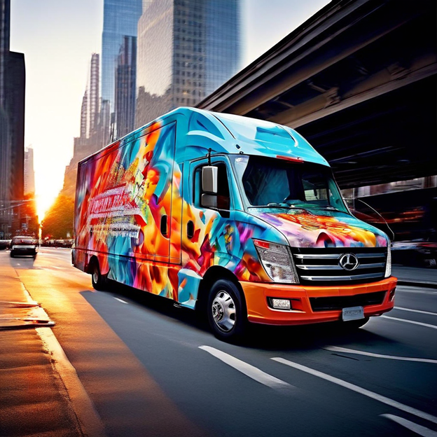
Vehicle wraps have emerged as a powerful and cost-effective mobile advertising solution, transforming ordinary vehicles into eye-catching billboards that can reach thousands of potential customers daily. This innovative marketing approach offers businesses a unique opportunity to increase brand visibility and engage with audiences in a non-intrusive manner while on the move. Table of Contents • Introduction • Maximizing Brand Visibility on the Go • Non-Intrusive Advertising Methods • Targeting Local Audiences • Eye-Catching Design Tips Section 1 Section 2 Section 3 Section 4 Maximizing Brand Visibility on the Go Vehicle wraps offer an unparalleled opportunity to maximize brand visibility while on the go. By transforming company vehicles into mobile billboards, businesses can reach a vast audience across diverse locations, significantly increasing their brand exposure. Studies have shown that a single wrapped vehicle can generate between 30,000 to 70,000 impressions daily, depending on the area and population density(1)(2). This high-impact advertising method ensures that your brand message is seen by potential customers during their daily commutes, errands, and leisure activities. Unlike traditional static billboards, vehicle wraps provide dynamic advertising that moves with traffic patterns, allowing your brand to reach areas where conventional advertising may be restricted or prohibitively expensive(3). Additionally, the eye-catching nature of well-designed vehicle wraps can create a lasting impression on viewers, enhancing brand recall and recognition even in brief encounters.(4) Non-Intrusive Advertising Methods Non-intrusive advertising methods have gained prominence as consumers increasingly seek personalized, unobtrusive marketing experiences. Vehicle wraps exemplify this approach, seamlessly integrating brand messages into the urban landscape without disrupting daily life. Unlike intrusive pop-ups or unsolicited videos, wrapped vehicles offer passive exposure that respects user experience while maintaining high visibility. This method aligns with the growing preference for contextual ad formats, where advertising is creatively and carefully designed to blend with its environment. By presenting relevant information in a non-disruptive manner, vehicle wraps can drive higher attentiveness and engagement compared to interruptive advertising techniques. This approach not only enhances brand perception but also fosters positive associations, as consumers appreciate marketing efforts that add value without imposing on their time or space. Targeting Local Audiences Vehicle wraps offer a powerful tool for targeting local audiences, providing businesses with a unique opportunity to connect with their community. By strategically routing wrapped vehicles through specific neighborhoods or high-traffic areas, companies can ensure their message reaches potential customers in their immediate vicinity(2). This localized approach increases the relevance of advertising, as viewers are more likely to engage with services or products available in their area. Vehicle wraps also help build relationships within the community, fostering trust and loyalty among local consumers(2). Additionally, the mobile nature of vehicle wraps allows businesses to adapt their marketing strategy to different local events, seasons, or promotional campaigns, ensuring a dynamic and responsive approach to local advertising(4). This targeted method of marketing not only enhances brand recognition but also provides a cost-effective solution for businesses looking to establish a strong presence in their local market. Eye-Catching Design Tips Creating an eye-catching vehicle wrap design is crucial for maximizing the impact of mobile advertising. Here are some key tips to ensure your vehicle wrap stands out and captures attention: Keep it simple yet bold: Avoid overloading the wrap with too much information or intricate details, as this can make the design difficult to read and less effective.(1) Choose the right color palette: Consider the psychology of colors and how certain hues can evoke specific emotions and draw attention. Select colors that align with your brand and message.(2) Incorporate unique graphics and patterns: Use eye-catching elements like geometric shapes or custom illustrations to make your vehicle stand out on the streets.(2) Ensure readability: Use large, clear fonts and high-contrast color combinations to make your message easily readable from a distance and while the vehicle is in motion.(3) Utilize the entire vehicle: Take advantage of the full surface area, including windows and body contours, to create a cohesive and impactful design.(4) Consider the vehicle’s shape: Design your wrap to complement the vehicle’s unique features and lines, enhancing its overall appearance.(5) Add personal touches: Incorporate elements that reflect your brand’s personality or the specific message you want to convey, making the wrap more memorable and engaging.(2) By following these design tips, you can create a vehicle wrap that not only catches the eye but also effectively communicates your brand message to potential customers on the go
Creating Effective Banners for Maximum Impact

Creating effective banners for maximum impact requires a strategic approach that balances visual appeal with clear messaging. According to design experts, successful banner graphics focus on key elements such as visual hierarchy, concise text, and compelling calls-to-action to drive engagement and achieve specific marketing goals. Table of Contents • Introduction • Understanding Visual Hierarchy in Banner Design • The Role of Color Psychology in Banners • Optimizing Banner Graphics for Faster Load Times Section 1 Section 2 Section 3 Section 4 Understanding Visual Hierarchy in Banner Design Visual hierarchy is a crucial aspect of banner design that guides viewers’ attention and enhances the effectiveness of the message. By strategically arranging elements, designers can create a clear path for the eye to follow, ensuring that the most important information stands out. Here are key principles of visual hierarchy in banner design: Size and scale: Larger elements naturally draw more attention and are perceived as more important. Color and contrast: Vibrant colors and high contrast help certain elements pop and grab focus. Typography: Varied font sizes, weights, and styles establish order and significance of text elements. Spacing and proximity: The arrangement and distance between elements can group or separate information, influencing interpretation. Alignment: Proper alignment creates order and helps in structured content presentation. Repetition and consistency: Repeating elements and maintaining consistency enhances user understanding and recognition. By applying these principles, designers can create banners that effectively communicate their message and guide viewers through the content in a logical, visually appealing manner(1)(2). Additionally, using techniques like strategically placed animations (e.g., pulsating buttons) can further enhance the visual hierarchy and guide users towards desired interactions.(1) The Role of Color Psychology in Banners Color psychology plays a crucial role in banner design, significantly influencing viewer response and brand perception. Different colors evoke specific emotions and associations, which can be leveraged to enhance banner performance and align with marketing goals. For instance, red is often associated with energy and excitement, making it effective for sales promotions, while blue conveys trust and reliability, suitable for businesses aiming to build credibility. Green can represent health and eco-friendliness, appealing to environmentally conscious consumers. It’s important to consider cultural differences in color interpretation, as meanings can vary across different audiences. Effective use of color in banners can capture attention, establish visual hierarchy, and reinforce brand identity. Studies have shown that people form initial impressions within 90 seconds, with up to 90% of that assessment based solely on color. Therefore, strategic color choices in banner design can significantly impact engagement and conversion rates. Optimizing Banner Graphics for Faster Load Times Optimizing banner graphics for faster load times is crucial for improving user experience and website performance. Key strategies include choosing the right file format, compressing images without compromising quality, and implementing responsive design techniques. JPEG is generally preferred for photographs, while PNG is suitable for images with transparency(2). Compressing images using tools like TinyPNG can reduce file sizes by up to 70% without noticeable quality loss(4). Implementing lazy loading delays the loading of non-visible images until users scroll to them, reducing initial page load time(3). Responsive images that adapt to different screen sizes prevent unnecessary bandwidth usage, especially on mobile devices(3). Additionally, using Content Delivery Networks (CDNs) specifically designed for images can significantly improve load times by serving images from servers closer to the user(3). For HTML5 banners, minimizing unnecessary animations, texts, and frames can further reduce weight and improve loading speed.(4)
How Coroplast Signs Are Revolutionizing Temporary Advertising

Coroplast signs are emerging as a game-changer in the world of temporary advertising, offering businesses a cost-effective, versatile, and durable solution for short-term promotions and events. These lightweight, weather-resistant signs are transforming how companies approach temporary marketing campaigns, providing an efficient way to capture attention and deliver messages to potential customers Table of Contents • Introduction • Environmental Benefits of Coroplast Signs • Innovative Design Ideas for Coroplast Signs • Case Studies: Successful Campaigns Using Coroplast Signs • Eco-Friendly Manufacturing Processes Section 1 Section 2 Section 3 Section 4 Environmental Benefits of Coroplast Signs Coroplast signs offer significant environmental benefits, making them an eco-conscious choice for temporary advertising. Made from polypropylene, these signs are 100% recyclable, supporting green initiatives and reducing waste in marketing campaigns. Their durability and weather resistance allow for extended use and reusability, minimizing the need for frequent replacements and conserving resources. The lightweight nature of Coroplast also contributes to reduced transportation emissions during distribution. Furthermore, the material’s twin-wall fluted structure provides strength and rigidity while using less material, aligning with the principle of reducing environmental impact. By choosing Coroplast signs, businesses can effectively promote their messages while demonstrating a commitment to sustainability and responsible resource management. Innovative Design Ideas for Coroplast Signs Coroplast signs offer endless possibilities for creative and eye-catching designs that can make your advertising stand out. Their versatility allows for unique shapes, vibrant colors, and custom graphics to be incorporated easily. Businesses can experiment with unconventional designs like die-cut shapes that represent their products or brand identity, creating memorable visuals that capture attention. Multi-layered designs can add depth and dimension, while incorporating QR codes or augmented reality elements can enhance interactivity and engagement. The lightweight nature of Coroplast also enables the creation of 3D structures or freestanding displays that go beyond traditional flat signage. By thinking outside the box and leveraging Coroplast’s flexibility, advertisers can craft innovative designs that not only convey their message effectively but also leave a lasting impression on their target audience. Case Studies: Successful Campaigns Using Coroplast Signs Coroplast signs have proven to be highly effective in various advertising campaigns across different industries. Here are some notable case studies showcasing successful implementations of Coroplast signs in temporary advertising: Political Campaigns: Coroplast yard signs played a crucial role in local and national elections, providing candidates with cost-effective and widespread visibility. Retail Promotions: A major retail chain used Coroplast signs for a seasonal sale, resulting in increased foot traffic and sales due to their eye-catching designs and strategic placement. Real Estate: Realtors utilized Coroplast “For Sale” signs to effectively market properties, benefiting from the material’s durability in outdoor conditions. Event Marketing: A music festival employed custom-shaped Coroplast signs for wayfinding and branding, enhancing attendee experience and reinforcing the event’s identity. Temporary Business Signage: A pop-up shop used Coroplast signs for storefront advertising and interior displays, quickly establishing brand presence at a fraction of the cost of permanent signage. These case studies demonstrate the versatility and effectiveness of Coroplast signs in achieving advertising goals across various sectors, highlighting their ability to deliver impactful results in short-term promotional efforts. Eco-Friendly Manufacturing Processes Eco-friendly manufacturing processes are revolutionizing the production industry by minimizing environmental impact and promoting sustainability. These processes incorporate renewable energy sources, waste reduction strategies, and green materials to create more sustainable products. Companies are increasingly adopting closed-loop manufacturing systems, which enable the reuse of materials and reduce demand for virgin resources. Advanced technologies like smart sensors, automation, and artificial intelligence are being utilized to optimize resource usage and decrease environmental impact. Additionally, manufacturers are implementing energy-efficient technologies, sustainable materials, and comprehensive waste reduction strategies to transform their production methods. By embracing these eco-friendly practices, companies not only reduce their carbon footprint but also often achieve long-term cost savings and improved brand reputation.
PVC Signs Affordable Solutions for Any Business

PVC signs offer businesses a cost-effective and versatile advertising solution, combining durability with customization options. As reported by Catdi Printing, these lightweight yet robust signs can be printed in vibrant colors, are suitable for both indoor and outdoor use, and provide a professional look without breaking the bank. Table of Contents • Introduction • Comparing PVC Signs to Other Signage Materials • Environmental Impact of PVC Signage Section 1 Section 2 Section 3 Section 4 Comparing PVC Signs to Other Signage Materials PVC signs offer unique advantages when compared to other signage materials. They are more cost-effective than metal or plexiglass options, making them an attractive choice for businesses on a budget. While not as durable as metal signs in harsh weather conditions, PVC signs are weather-resistant and can withstand moderate outdoor exposure. In terms of aesthetics, PVC signs may not match the modern sophistication of acrylic signs or the natural charm of wood signs, but they offer greater customization options and are easier to maintain. PVC is also lighter than aluminum, making it ideal for large wall-mounted signs or portable displays. However, for businesses prioritizing sustainability, materials like metal and acrylic are more environmentally friendly due to their recyclability. Environmental Impact of PVC Signage PVC signage, while cost-effective and versatile, raises significant environmental concerns. According to Elmtree Signs, PVC is considered the most environmentally damaging plastic, with over 80% of non-recyclable signage ending up in landfills. The material’s poor sustainability credentials stem from its difficulty in recycling and potential to release toxic chemicals during production, use, and disposal. As businesses become more environmentally conscious, many are seeking alternatives to PVC signage. PVC-free vinyl options, such as PP (polypropylene), PET (polythene terephthalate), and polyester vinyl, offer more sustainable and eco-friendly alternatives that are 100% recyclable and have a smaller carbon footprint. While PVC-free options may be initially more expensive, they often prove to be a smarter long-term investment due to their durability and reduced environmental impact.
Why Aluminum Signs Are a Durable Choice for Outdoor Use

Aluminum signs have become a popular choice for outdoor signage due to their exceptional durability and weather resistance. As reported by industry experts, these versatile signs can withstand harsh environmental conditions, including rain, snow, and extreme temperatures, making them an ideal solution for businesses seeking long-lasting and cost-effective outdoor advertising options. Table of Contents Introduction Comparing Aluminum to Other Sign Materials Real-World Examples of Aluminum Sign Durability Maintenance Tips for Prolonging the Life of Aluminum Signs Section 1 Section 2 Section 3 Section 4 Comparing Aluminum to Other Sign Materials Aluminum signs offer distinct advantages when compared to other common sign materials. Unlike wood, which can rot or warp in outdoor conditions, aluminum remains structurally sound and resistant to moisture damage. Compared to plastic signs, aluminum provides superior durability and a more professional appearance, making it ideal for long-term outdoor use. While both aluminum and High-Density Urethane (HDU) signs are durable, aluminum generally requires less maintenance over time and is more resistant to extreme weather conditions. Additionally, aluminum signs are often more cost-effective in the long run due to their longevity and low maintenance requirements, despite potentially higher initial costs compared to some alternatives. The material’s versatility also allows for various finishes and printing options, providing businesses with greater customization possibilities than many other sign materials. Real-World Examples of Aluminum Sign Durability Aluminum signs have proven their durability in various real-world applications, demonstrating their ability to withstand harsh conditions and maintain their appearance over time. In outdoor settings, such as national parks and coastal areas, aluminum signs have shown remarkable resilience against extreme weather, including intense UV exposure, salt spray, and temperature fluctuations. These signs often remain legible and structurally sound for several years, even in challenging environments. For instance, aluminum traffic signs on busy highways have been observed to retain their reflectivity and clarity for extended periods, ensuring continued safety and visibility for motorists. In urban settings, aluminum business signs have successfully endured years of exposure to pollution, acid rain, and physical wear without significant degradation, showcasing their ability to maintain a professional appearance in demanding conditions. These real-world examples highlight the exceptional durability of aluminum signs, making them a reliable choice for long-term outdoor use across various industries and environments. Maintenance Tips for Prolonging the Life of Aluminum Signs Proper maintenance is crucial for maximizing the lifespan and appearance of aluminum signs. Here are some essential tips to help prolong the life of your aluminum signage: Clean regularly: Wash your aluminum signs every 1-2 months to keep them looking new and prevent buildup of dirt and grime. Use gentle cleaning solutions: Stick to water, glass cleaners, or rubbing alcohol for cleaning. Avoid harsh chemicals that can erode the material. Choose the right cleaning cloth: Use a microfiber cloth to prevent streaks and residue. Alternatively, a soft sponge or cotton towel can be used. Clean from the center outwards: When cleaning, start from the middle of the sign and work your way to the edges for best results. Avoid oversaturation: Use a spray bottle to apply cleaning solution to prevent excessive moisture on the sign. Inspect regularly: Check for any damage or wear and address issues promptly to prevent further deterioration. Use gentle cleaning techniques: Wipe the sign gently, paying attention to small crevices and corners. By following these maintenance tips, you can help ensure your aluminum signs remain bright, appealing, and functional for up to 5 years or more.
