The Benefits of Coroplast Signs for Short-Term Campaigns
Coroplast signs, known for their durability, affordability, and versatility, have become a popular choice for short-term promotional campaigns and events. As reported by Denver Printing Company, these lightweight, weather-resistant signs offer businesses and organizations a cost-effective way to boost visibility and attract attention quickly and easily. Table of Contents • Introduction • Environmental Benefits of Coroplast Signs • Designing Eye-Catching Coroplast Signs • Effective Placement Strategies for Coroplast Signs Section 1 Section 2 Section 3 Section 4 Environmental Benefits of Coroplast Signs Coroplast signs offer significant environmental benefits, making them an eco-conscious choice for short-term campaigns. These signs are made from polypropylene plastic, which is 100% recyclable, supporting sustainability efforts and reducing waste. The durability of Coroplast signs extends their lifespan, minimizing the need for frequent replacements and further reducing environmental impact. Additionally, their lightweight nature reduces transportation-related emissions compared to heavier signage materials. Coroplast’s recyclability aligns with green campaign initiatives, allowing organizations to demonstrate their commitment to environmental responsibility while effectively promoting their message. The material’s ability to be repurposed or recycled after use contributes to a circular economy, keeping materials in use and minimizing landfill waste. Designing Eye-Catching Coroplast Signs Designing eye-catching Coroplast signs requires a strategic approach to color, graphics, and shape to maximize impact and visibility. Vibrant colors and bold patterns can make signs pop and grab attention from afar, while contrasting hues effectively highlight important text or graphics. Eye-catching graphics should be visually interesting and memorable, with simple yet impactful designs featuring bold lines, shapes, or typography that catch people’s eyes as they pass by. Unique shapes can add personality and further enhance a sign’s appeal, helping it stand out in crowded environments. When creating Coroplast signs, it’s crucial to consider the balance between creativity and clarity, ensuring the message remains easily readable while still being visually striking. High-resolution graphics and UV-resistant ink can be printed directly onto the surface, ensuring long-lasting vibrancy even in outdoor conditions. Effective Placement Strategies for Coroplast Signs Effective placement of Coroplast signs is crucial for maximizing their impact and achieving cost-effective results in advertising campaigns. Strategic positioning in high-traffic areas or near other forms of traditional or digital ads can significantly enhance visibility and reach. For optimal effectiveness, signs should be placed at eye level when possible, ensuring that potential customers will notice them. It’s also important to consider the relevance of the location to the target audience. Placing signs within the context of their intended audience increases the likelihood of engagement and serious consideration of the message. For example, targeting an affluent customer base may yield better results by positioning signs in upscale areas rather than lower-income neighborhoods. Additionally, utilizing multiple channels by combining Coroplast signs with digital media or other outdoor placements can provide greater exposure and increase the chances of campaign success.
How important are Poster Designs for your business
Poster design is a powerful visual art form that combines creativity and strategic communication to capture attention and convey messages effectively. From establishing a strong concept to utilizing negative space and typography, the art of crafting a compelling poster involves several key elements that work together to make a design truly pop. Table of Contents • Introduction • The Role of Color Psychology in Poster Design • Using Typography to Create Visual Hierarchy • Color and Emotion Impact Section 1 Section 2 Section 3 Section 4 The Role of Color Psychology in Poster Design Color psychology plays a crucial role in poster design, influencing viewers’ emotions and perceptions. Different colors evoke specific psychological responses: warm colors like red, orange, and yellow are associated with energy and optimism, while cool colors such as blue and green symbolize peace and harmony. For example, blue often conveys security and trustworthiness, red signifies power and passion, and yellow represents optimism and freshness. Designers strategically use color combinations to create visual hierarchy, guide attention, and reinforce the poster’s message. High-contrast color pairings can make elements stand out, while complementary colors create balance. Cultural context is also important, as color meanings can vary across different societies. By understanding these psychological impacts, designers can effectively trigger desired emotional responses and enhance the overall effectiveness of their poster designs. Using Typography to Create Visual Hierarchy Typography plays a crucial role in creating visual hierarchy within poster design, guiding the viewer’s eye and emphasizing key information. Designers use various typographic elements to establish a clear hierarchy, including size, weight, color, and spacing. Larger font sizes are typically employed for headlines or main messages to grab attention, while smaller sizes are used for supporting text (1)(4). Font weight can also differentiate importance, with bolder typefaces drawing more focus than lighter ones(2). Color contrast between text and background, as well as between different text elements, helps to further define the hierarchy (3). Additionally, designers may utilize different font styles, cases, and alignments to create distinct levels of importance within the poster’s content (4). By carefully manipulating these typographic elements, designers can effectively structure information, ensuring that the most critical messages are immediately apparent to viewers while maintaining overall visual harmony and readability Color and Emotion Impact
Maximizing the Impact of Magnetic Signs for Local Advertising
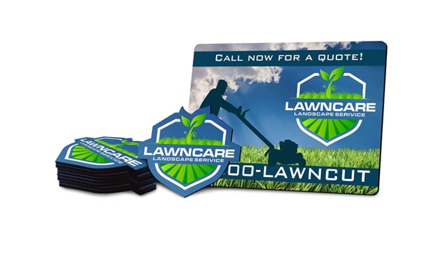
Custom magnetic signs offer a versatile and cost-effective solution for local businesses looking to boost their advertising efforts. As reported by Rochester Magnet, these mobile billboards transform vehicles into dynamic advertising platforms, providing unparalleled brand exposure and recognition while allowing for targeted messaging in specific localities Table of Contents • Introduction • Innovative Uses for Magnetic Signs in Local Marketing • Design Tips for Eye-Catching Magnetic Signs Section 1 Section 2 Section 3 Section 4 Innovative Uses for Magnetic Signs in Local Marketing Magnetic signs offer versatile applications beyond vehicle advertising for local businesses. Restaurants can use magnetic menu boards to easily update daily specials without reprinting. For pop-up shops and events, magnetic signs provide portable, eye-catching displays that can be quickly set up and removed. Some companies even create magnetic business cards, increasing the likelihood that potential customers will keep and reference them . Additionally, magnetic signs can be used for temporary promotions in storefronts or to create interactive displays at trade shows, enhancing customer engagement . These innovative uses allow businesses to maximize their marketing impact while maintaining flexibility and cost-effectiveness in their advertising strategies. Design Tips for Eye-Catching Magnetic Signs When designing magnetic signs for local advertising, simplicity and visual impact are key. Keep the design clean and uncluttered, focusing on essential information like your company name, logo, phone number, and a brief tagline if needed. Use bold, easy-to-read fonts and avoid small text or fine print, as viewers often have only seconds to read the sign while in motion. Incorporate full-color graphics and eye-catching visuals to make your sign stand out and quickly convey your message. Choose colors that align with your brand and evoke the desired emotional response – for example, blue for calmness or red for urgency. Ensure your design files are high-resolution to prevent grainy or distorted images when enlarged for the sign. By following these design principles, you can create magnetic signs that effectively capture attention and promote your local business. When designing magnetic signs for local advertising, simplicity and visual impact are key. Keep the design clean and uncluttered, focusing on essential information like your company name, logo, phone number, and a brief tagline if needed. Use bold, easy-to-read fonts and avoid small text or fine print, as viewers often have only seconds to read the sign while in motion. Incorporate full-color graphics and eye-catching visuals to make your sign stand out and quickly convey your message. Choose colors that align with your brand and evoke the desired emotional response – for example, blue for calmness or red for urgency. Ensure your design files are high-resolution to prevent grainy or distorted images when enlarged for the sign. By following these design principles, you can create magnetic signs that effectively capture attention and promote your local business.
Using Window Clings to Enhance Your Storefront Display
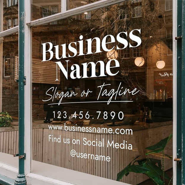
Window clings offer a versatile and cost-effective solution for local businesses looking to enhance their storefront displays and attract customers. These eye-catching, easily removable graphics can be customized to promote sales, reinforce branding, or create seasonal displays, making them an ideal tool for businesses aiming to stand out in competitive commercial areas. Table of Contents • Introduction • Creative Seasonal Themes with Window Clings • Boosting Foot Traffic with Promotional Window Graphics • Seasonal Sales Promotions Section 1 Section 2 Section 3 Section 4 Creative Seasonal Themes with Window Clings Window clings provide an excellent opportunity for businesses to create engaging seasonal themes that capture customers’ attention and enhance the overall shopping experience. Retailers can easily transform their storefronts with holiday-specific designs, such as snowflakes and Santa Claus figures for Christmas, or pumpkins and witches for Halloween. These seasonal decorations not only celebrate various holidays but also create a festive atmosphere that can boost foot traffic and sales. For example, businesses can use window clings featuring flowers and trees to welcome spring, or beach-themed designs to usher in summer. The versatility of window clings allows for quick and easy changes throughout the year, enabling stores to keep their displays fresh and relevant to current seasons or events without the need for extensive renovations or permanent alterations to the storefront. Boosting Foot Traffic with Promotional Window Graphics Window graphics serve as powerful tools for businesses to increase foot traffic and attract potential customers. By strategically using promotional window decals, stores can effectively showcase their products, services, and special offers to passersby. Seasonal and promotional graphics keep the storefront fresh and relevant, enticing customers with timely and compelling offers. For maximum impact, businesses should create extremely compelling promotions that customers can’t turn down, using window graphics to highlight these irresistible deals. Short-term applications of window graphics are particularly effective for pushing upcoming promotions and attracting immediate attention. This dynamic approach to storefront advertising not only enhances the visual appeal of the business but also serves as a cost-effective strategy to boost foot traffic and potentially increase sales. Seasonal Sales Promotions Seasonal sales promotions are an effective strategy for businesses to boost revenue and engage customers during specific times of the year. Here are some key benefits and ideas for implementing seasonal promotions: Increase brand awareness and attract new customers Boost product sales and revenue during specific periods Enhance customer loyalty and encourage repeat purchases Clear out old inventory to make room for new stock Capitalize on consumer spending patterns during holidays and events Effective seasonal promotion ideas include: Create themed product bundles or packages Offer limited-time discounts or flash sales Run contests or giveaways tied to seasonal events Implement buy-one-get-one (BOGO) offers Provide exclusive deals for newsletter subscribers or loyalty program members When planning seasonal promotions, businesses should analyze past trends, set clear goals, and tailor their marketing efforts to target specific customer segments. By aligning promotional strategies with seasonal events and consumer behavior, companies can maximize returns and create a sense of urgency that drives sales.
The Art of Designing Eye-Catching Posters for Your Business
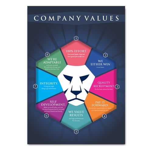
Designing eye-catching posters is a powerful way to promote your business, combining visual appeal with concise messaging to capture audience attention quickly. From defining clear objectives to balancing composition and using contrasting colors, the art of poster design requires careful consideration of various elements to create a compelling and effective marketing tool. Table of Contents • Introduction • The Psychology Behind Color Choices • Effective Use of Typography in Posters • Balancing Visual Elements for Maximum Impact Section 1 Section 2 Section 3 Section 4 The Psychology Behind Color Choices Color psychology plays a crucial role in designing effective business posters, as different hues can evoke specific emotions and influence consumer behavior. Red, for instance, is associated with passion and excitement, potentially increasing heart rate and creating a sense of urgency. Blue, on the other hand, often conveys trust, stability, and professionalism, making it a popular choice for corporate branding. Yellow is linked to optimism and creativity, while green can represent growth and harmony. When selecting colors for your poster, consider the emotional response you want to elicit from your audience and how it aligns with your brand message. It’s important to note that color associations can vary across cultures, so research your target market to ensure your color choices resonate appropriately. Effective Use of Typography in Posters Typography plays a crucial role in poster design, serving as both a visual element and a means of conveying information. Effective use of typography can significantly enhance the impact and readability of your business poster. When selecting fonts, consider using a combination of serif and sans-serif typefaces to create contrast and hierarchy. Limit your choices to two or three fonts to maintain clarity and avoid visual clutter. The size and weight of text should be used strategically to guide the viewer’s eye and emphasize key information . Pay attention to leading (line spacing) and kerning (letter spacing) to ensure optimal readability. Alignment is also critical; use a consistent system to line up key elements and create a balanced layout. Remember that typography is not just about aesthetics but also about effectively communicating your message. As Janine Henrichs, a Shillington graduate, notes, “Typography on your poster can have a profound effect on the way audiences digest and perceive the information that is being conveyed by the text Balancing Visual Elements for Maximum Impact Balance in graphic design is crucial for creating visually appealing and effective posters that capture audience attention. It involves distributing visual elements across the composition to achieve a sense of stability and harmony. Designers can employ various types of balance, including symmetrical, asymmetrical, and radial, to create different effects and convey specific messages. Symmetrical balance creates a sense of order and stability, while asymmetrical balance can add tension and visual interest. The strategic use of color, shape, and size can also contribute to balance, with small areas of bright colors balancing larger areas of neutral tones, or complex shapes balancing flat, plain compositions. Achieving proper balance ensures that the viewer’s eye is guided through the poster’s content effectively, enhancing the overall impact and communication of the business message.
How to Create a Professional Brochure That Converts

Creating a professional brochure that converts requires a strategic approach, combining compelling design with persuasive content. As reported by Super Copy Editors, effective brochures focus on the reader’s needs, using proper formatting and concise language to capture attention and drive action. Table of Contents • Introduction • Leveraging Visual Storytelling • Incorporating Customer Testimonials • Maximizing Mobile Compatibility Section 1 Section 2 Section 3 Section 4 Leveraging Visual Storytelling Visual storytelling is a powerful tool for creating engaging brochures that captivate audiences and drive conversions. By incorporating compelling images, infographics, and thoughtful design elements, brochures can effectively convey a brand’s narrative and evoke emotional responses from readers. The strategic layering of visual elements, when combined with a clear narrative flow, can tell a story as compelling as any written text. For example, a travel brochure might start with a stunning full-page image of a destination, followed by details of experiences and testimonials, leading to tour packages and booking information. This approach not only informs but also immerses the viewer in a meticulously crafted world, making the brochure more memorable and persuasive. Incorporating Customer Testimonials Incorporating customer testimonials into brochures can significantly enhance their effectiveness and credibility. Testimonials provide social proof, showcasing real-life experiences that potential customers can relate to. When selecting testimonials, focus on those that address specific consumer needs or solve problems, as these are more impactful than generic praise. Place testimonials strategically throughout the brochure, pairing them with relevant content to reinforce key messages. For maximum impact, use concise, easily scannable quotes and consider including visuals such as customer photos or even video testimonials if the format allows. By thoughtfully integrating customer testimonials, brochures can build trust, demonstrate value, and ultimately drive conversions more effectively. Maximizing Mobile Compatibility Maximizing mobile compatibility is crucial for digital brochures in today’s smartphone-dominated landscape. A mobile-friendly design ensures wider reach and improved user experience, potentially increasing engagement and conversions. Key strategies include implementing responsive design that adapts to various screen sizes, optimizing visuals for quick loading without compromising quality, and using easily readable fonts. Additionally, streamlining content for concise messaging, creating tappable interactive elements with adequate spacing, and testing across multiple devices are essential for effective mobile optimization. Mobile-compatible training materials can also benefit businesses internally by increasing information retention, lowering training costs, and allowing for on-site, up-to-date training. By prioritizing mobile compatibility, businesses can enhance their brochures’ accessibility and effectiveness across all platforms.
Designing Flyers That Grab Attention and Drive Results
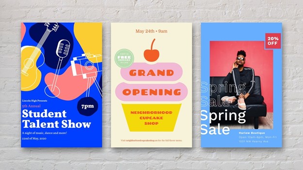
Flyers remain a powerful marketing tool for businesses, offering a tangible way to capture attention and convey key messages in an increasingly digital world. This blog explores effective strategies for designing eye-catching flyers that not only grab attention but also drive measurable results for your business. Table of Contents • Introduction • Choosing the Right Color Scheme for Maximum Impact • Color Harmony and Contrast • Leveraging Seasonal Themes in Flyer Campaigns Section 1 Section 2 Section 3 Section 4 Choosing the Right Color Scheme for Maximum Impact Selecting an effective color scheme is crucial for creating flyers that grab attention and convey the right message. High-contrast color combinations, such as complementary colors or triadic schemes, can maximize legibility and visual impact. For example, blue paired with reddish-orange and orange-yellow creates a vibrant, eye-catching palette. When choosing colors, consider your brand identity and target audience. Limit your palette to two or three main colors to maintain a clean, sophisticated look. Popular color combinations include primary colors (red, blue, yellow) for a playful vibe, neon hues for excitement, and pastel tones for a calming effect. Additionally, strategic use of contrasting colors can highlight key information and improve readability. Remember that colors evoke emotions and cultural associations, so choose a palette that aligns with your flyer’s purpose and resonates with your intended audience. Color Harmony and Contrast Color harmony and contrast are essential principles in creating visually appealing and effective flyers. Harmonious color combinations create a sense of balance and unity, while strategic contrast draws attention to key elements. The color wheel is a valuable tool for selecting harmonious color schemes, such as complementary colors (opposite on the wheel) or triadic colors (equally spaced). For example, using light red and its complement cyan can create a balanced and visually striking design. Contrast is crucial for readability and highlighting important information. High contrast between text and background ensures legibility, while using an accent color can emphasize key details like headlines or calls to action. When designing flyers, limit your palette to two or three main colors to maintain a clean, sophisticated look. Additionally, consider the emotional associations of colors – for instance, red evokes passion and urgency, while blue conveys calmness and trust. By thoughtfully applying color harmony and contrast principles, you can create flyers that not only catch the eye but also effectively communicate your message Leveraging Seasonal Themes in Flyer Campaigns Leveraging seasonal themes in flyer campaigns can significantly boost engagement and drive results by aligning with audience interests and current events. Seasonal marketing capitalizes on the excitement and high traffic associated with specific times of the year, holidays, or events. For example, a summer-themed flyer could incorporate vibrant colors, outdoor imagery, and promotions tailored to warm-weather activities. When designing seasonal flyers, it’s crucial to understand your audience’s preferences and pain points to create targeted, relevant content. Utilize eye-catching visuals that reflect the season, such as sunny landscapes for summer or cozy interiors for winter. Additionally, consider offering special promotions or discounts tied to the season to incentivize customer action. By infusing your brand’s unique perspective into seasonal themes, you can create memorable flyers that stand out and resonate with your audience, ultimately driving engagement and conversions.
3 Key Benefits of ADA Compliance for Accessibility and Safety
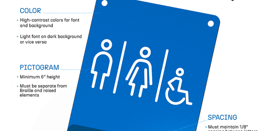
ADA Compliance signs play a crucial role in ensuring accessibility and inclusivity for individuals with disabilities, while also helping businesses meet legal requirements and avoid potential penalties. These signs, designed to meet the standards of the Americans with Disabilities Act, serve multiple purposes, from identifying permanent spaces to providing essential safety information and directions. Table of Contents Introduction Historical Context of the ADA Key Features of ADA-Compliant Signs Key Milestones in ADA Legislation Section 1 Section 2 Section 3 Section 4 Historical Context of the ADA The Americans with Disabilities Act (ADA) emerged from a long history of disability rights advocacy and civil rights movements in the United States. The groundwork for the ADA was laid by earlier legislation, particularly Section 504 of the Rehabilitation Act of 1973, which prohibited discrimination against people with disabilities by recipients of federal funds. This marked a shift in perspective, recognizing disability-related challenges as stemming from societal barriers rather than inherent limitations. The ADA’s development gained momentum in the 1980s, with the National Council on Disability playing a crucial role in drafting initial versions of the legislation. The Act was introduced in Congress in 1988, supported by extensive testimonies and evidence of discrimination gathered from across the country. After years of advocacy and negotiation, the ADA was finally signed into law by President George H.W. Bush on July 26, 1990, representing a landmark achievement in disability rights and civil rights legislation. Key Features of ADA Compliance Signs ADA-compliant signs must adhere to specific design requirements to ensure accessibility for all individuals. Key features include high contrast between text and background, non-glare finishes, and sans serif fonts for improved readability. Signs must also incorporate tactile elements such as raised characters and Braille for those with visual impairments. Proper placement is crucial, with signs typically mounted 48-60 inches above the floor and on the latch side of doors. Additionally, some signs require specific pictograms, such as the International Symbol of Accessibility. These features work together to create signage that is easily distinguishable and understood by people with various disabilities, promoting independence and safety in public spaces. Key Milestones in ADA Legislation The Americans with Disabilities Act (ADA) has undergone significant developments since its inception, with several key milestones shaping its implementation and impact. The following table highlights some of the most important dates in ADA legislation: ADA Milestones Table Year Milestone 1990 ADA signed into law by President George H.W. Bush on July 26 and key milestones 1991 Regulations issued for Titles I, II, III, and IV of the ADA 1992 Title I (employment) takes effect for employers with 25+ employees; Titles II and III become effective 1998 Section 508 amended with digital accessibility standards 2010 Updated regulations issued for Titles II and III 2013 Revised regulations for Title I issued by EEOC These milestones reflect the ongoing evolution of the ADA, from its initial signing into law to subsequent updates addressing emerging needs, particularly in the digital realm. The Act continues to be refined and interpreted to ensure comprehensive protection against discrimination for individuals with disabilities across various aspects of public life
The Advantages of 3D Signs for Enhanced Business Visibility
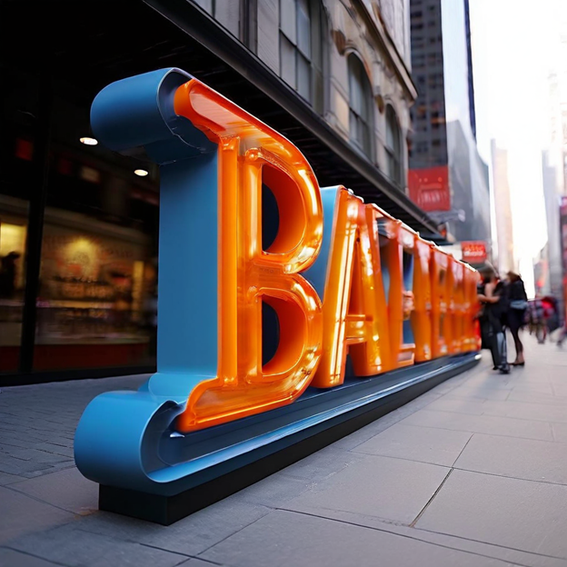
Three-dimensional signage has emerged as a powerful tool for businesses seeking to enhance their visibility and make a lasting impression on potential customers. From improved visibility and customization options to enhanced lighting effects and long-term cost-effectiveness, 3D signs offer a range of benefits that can elevate a company’s brand identity and attract more attention in competitive markets Table of Contents Introduction Customization Options for 3D Signs Durability and Weather Resistance Impact of 3D Signs on Brand Identity Section 1 Section 2 Section 3 Section 4 Customization Options for 3D Signs 3D signs offer a wide array of customization options, allowing businesses to create unique and eye-catching displays that align perfectly with their brand identity. These signs can be crafted from various materials such as acrylic, aluminum, PVC, and polycarbonate, each offering distinct aesthetic and durability properties. Businesses can choose from different font types, sizes, and colors for channel lettering, ensuring their signage matches their branding needs. Additionally, 3D signs can be enhanced with LED lighting for increased visibility and impact, particularly for exterior signage. The versatility extends to mounting options, including direct mounting, raceway mounts, and even tape mounting for interior signs. With the ability to incorporate logos, graphics, and dimensional elements, 3D signs provide a canvas for creativity, allowing businesses to craft striking visual representations that stand out from traditional flat signage. Durability and Weather Resistance 3D signs offer exceptional durability and weather resistance, making them a long-lasting investment for businesses. Here are key factors contributing to their resilience: Materials: 3D signs are typically made from sturdy materials like metal, acrylic, or high-density urethane (HDU) foam, which can withstand various environmental conditions. Protective coatings: Many 3D signs feature UV-resistant laminates or coatings that protect against fading and sun damage. Longevity: Depending on the grade and materials used, 3D signs can last anywhere from 3 to 10 years outdoors. Weather resistance: Quality 3D signs are designed to withstand rain, wind, and temperature fluctuations without cracking, chipping, or fading. Low maintenance: The durability of 3D signs often translates to reduced maintenance needs, saving businesses time and money in the long run. Return on investment: The long-lasting nature of 3D signs ensures that businesses get good value for their investment in signage. By choosing 3D signs, businesses can benefit from signage that maintains its visual appeal and functionality for years, even in challenging outdoor environments. Impact of 3D Signs on Brand Identity 3D signs have a significant impact on brand identity, serving as powerful visual representations that reinforce a company’s image and values. These signs enhance brand recognition by creating memorable, eye-catching displays that stand out in competitive markets. The customizable nature of 3D signs allows businesses to align their signage with their unique brand identity, incorporating specific colors, fonts, and design elements that reflect their corporate aesthetic. Moreover, 3D signs can tell a brand’s story through creative design, fostering emotional connections with consumers and improving brand recall. By consistently using 3D signs across various marketing channels, from storefronts to digital platforms, businesses can maintain a cohesive brand identity that resonates with their audience and strengthens their market presence.
Transform Your Space with Custom Vinyl Wall Decals

Custom vinyl wall decals offer a versatile and affordable way to transform any space, allowing homeowners and renters alike to express their personal style without the commitment of paint or wallpaper. From inspirational quotes to intricate designs, these easy-to-apply and removable decorations provide endless possibilities for adding character and visual interest to walls in living rooms, bedrooms, kitchens, and beyond. Table of Contents • Introduction • Incorporating Vinyl Decals in Small Spaces • Seasonal and Holiday Vinyl Decal Ideas • Combining Vinyl Decals with Other Decor Elements Section 1 Section 2 Section 3 Section 4 Incorporating Vinyl Decals in Small Spaces Vinyl decals are an excellent solution for decorating small spaces, offering a way to add personality and style without overwhelming the area. In compact rooms like powder rooms or laundry areas, small decals can create a big impact. For instance, tiny tree or floral decals can bring a touch of nature indoors, while geometric patterns can add a modern flair. These versatile decorations are particularly useful in rental properties, as they can be easily removed without damaging walls. To maximize the effect in small spaces, consider using decals to create focal points or to draw the eye upward, which can make the room feel larger. Additionally, vinyl stickers are perfect for personalizing smaller objects like laptops or water bottles, allowing for creativity even in the tiniest of spaces. Seasonal and Holiday Vinyl Decal Ideas Seasonal and holiday vinyl decals offer a festive and flexible way to decorate your home throughout the year. For Christmas, popular options include cheerful designs featuring farmhouse Christmas tree farms, snowmen, reindeer, and snowflakes, perfect for adding holiday cheer to living rooms or bedrooms. Halloween enthusiasts can embrace the spooky season with decals of spiders, pumpkins, and bats, ideal for decorating front doors to welcome trick-or-treaters. Other holiday-themed decals include Hanukkah calendars and garlands, as well as personalized Christmas tree box decorations featuring farmhouse truck designs. These high-quality vinyl decals are easy to apply and remove without leaving residue, allowing for seamless transitions between seasons. For those looking to create a winter wonderland, custom monograms with snowflakes can add a touch of elegance to any space. By incorporating these seasonal decals, you can effortlessly update your home’s decor to reflect the changing holidays and create a festive atmosphere year-round. Combining Vinyl Decals with Other Decor Elements Vinyl decals can be seamlessly integrated with other decor elements to create a cohesive and visually appealing space. When combined with wall art, decals can frame or complement existing pieces, adding depth and interest to gallery walls. For a layered look, consider pairing decals with floating shelves, using botanical vine decals to create faux frames around photos or posters. In the kitchen, utensil and serving ware decals can enhance the aesthetic when placed behind floating shelves, adding a cafe-chic vibe. Decals can also be used on furniture and appliances, such as refrigerators, to tie them into the overall design scheme. For a modern touch, geometric patterns or shapes can be combined with minimalist furniture and décor. By thoughtfully integrating vinyl decals with other design elements, you can create a unique and personalized space that reflects your style while maintaining a cohesive overall look.
